 Close Topic Options
Wide Screen Columns
Wide Screen Columns - Community News, FAQ, Feedback - Posted: 26th Mar, 2016 - 1:03pm
Wide Screen Columns
Wide Screen Columns
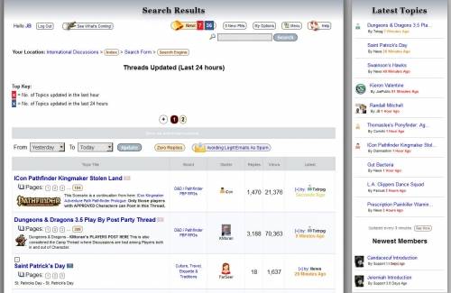
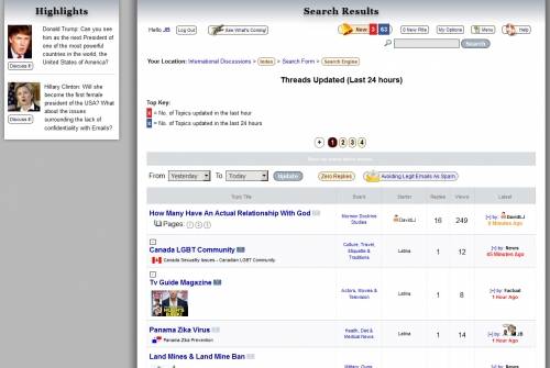
Members who use a wide screen will be able to see special columns on the left or right of the Community's content. These columns provide information about the Latest Posts, Newest Members, Highlighted Topics, special announcements, etc. Those on Tablets or Mobiles will not see these. Additionally, only those who use really wide screens will be able to see both columns while others may only see one column.

Wide Screen Columns (Hover)
Wide Screen Columns Feedback & FAQ News Community
Left Top Column
Just added a left column that will only be seen by those with larger screen. This column highlights current Topics, Events or Calendar items that are generally popular for everyone. At the moment it features a couple of Topics but will be more dynamic later.
Krusten, that's just what it's for… to let you know what's happening in the rest of the Community when you pass through.

Wide Screen Columns (Hover)
Columns Screen Wide
I didn't see this before because I usually logon with my phone. So when I used my desktop I was like what's those two things on the side of my screen. Having it on that in between page is a good way to catch us too rather than looking at the countdown for the next page. ![]() .
.
Wide Screen Columns
I was concerned about that column on the right showing up when I used my iPad but I was amazed when it wasn't there to get in the way.
Wide Screen Columns Community News FAQ & Feedback
Wide Screen Columns Applied To Role-playing Games
As mentioned here this feature will be extended to other areas of the site but the displayed content will be based on the area you are visiting rather than generalized.
Investigator, that is because this site is Mobile Responsive and adjust to your device.
 TOPIC: Wide Screen Columns
 Users with wide screen monitors can benefit from more content on every page.